
AMWELL DESIGN SYSTEM
Improving Snackbars for Operational Efficiency

Overview
The Amwell Design system is made up of systems and processes that empower all designers and developers to create high quality user experiences for our telehealth products.
In this case study, I’ll dive into the usability issues and improvements I proposed for the snackbar component.
Company
Amwell
Role
Individual Contributor — Design System Management and Documentation, UI/UX Design
Team
Worked alongside design system developers and accessibility consultant
Duration
Nov 2021 - Mar 2022
Problem
At Amwell, we use the snackbar component to provide lightweight feedback to a user-initiated operation in a non-disruptive manner. A usability issue was found with the snackbar getting lost at the bottom on large screens.
Through an audit across various products, I also identified multiple styles with no guidelines on how and when to use snackbars.
How might we improve the usability of the snackbar and provide clear guidelines for our teams?

Location
According to analytics, data from 1 year on the patient product showed that while the most popular screen resolution was for mobile size, the third most popular screen resolution was 1920x1080. For provider and admin products, these were mainly used on desktop devices. Therefore, I had to establish a notification pattern that could be used consistently across different breakpoints and products.
I was curious to see if there was a standard for snackbar location behavior, so I conducted competitor research. I analyzed 8 design systems and found that there was a split between top and bottom location for desktop. For mobile, most design systems used a bottom location.

Additionally, research in this Medium article showed that notifications situated in corners are easiest to scan and reach.

I also consulted with our in-house WCAG expert to gather an accessibility perspective. He provided insight that some users with low vision don’t use magnification software, but instead rely on screen resizing. This could trigger a display of mobile view on desktop, so we can’t just think “bottom of screen for mobile experience”, because it may not always be the right position.
Takeaways from other accessibility resources also aligned with our team’s concern in showing notifications at the bottom.

After triangulating research insights and talking with stakeholders, I hypothesized that positioning the snackbar at the top for mobile and desktop would be the best location.
My next step was to visually explore the locations in designs across our provider, consumer, and admin products.
Reasoning for top position on mobile
Top position prevents errors by maximizing distance between snackbar and menu
Bottom position blocks primary actions at bottom (video control buttons, primary actions, menu tabs, etc)

Reasoning for top right corner position on desktop
The top left corner blocks the header and breadcrumbs for navigation
The top right corner does not block primary actions and prevents errors by maximizing distance between notification and primary actions at bottom
The bottom corner positions make notifications hard to view
In the scenario of the video experience, the top right corner is still preferable for consistency even though it blocks the self view. This is not a major issue because the user’s priority is viewing the other person on the call.


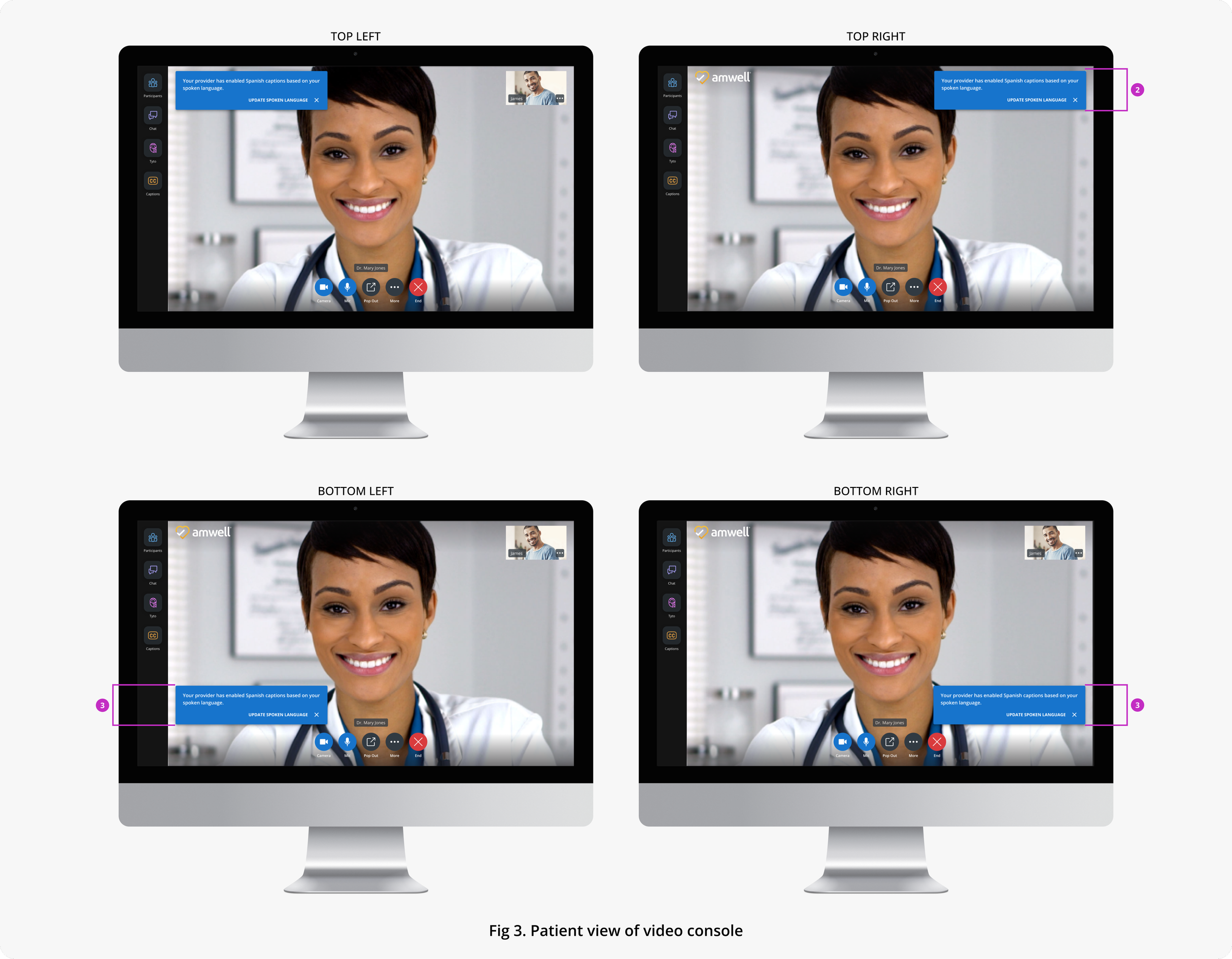

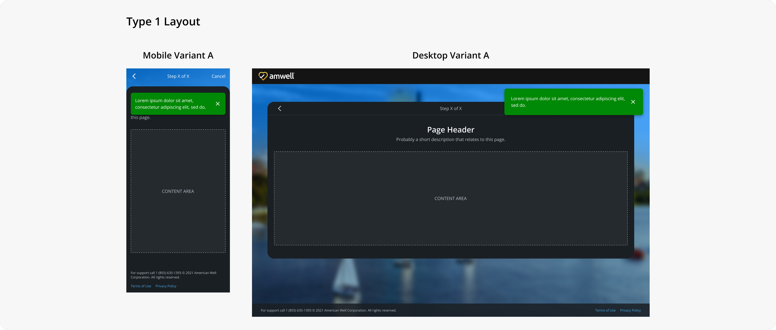
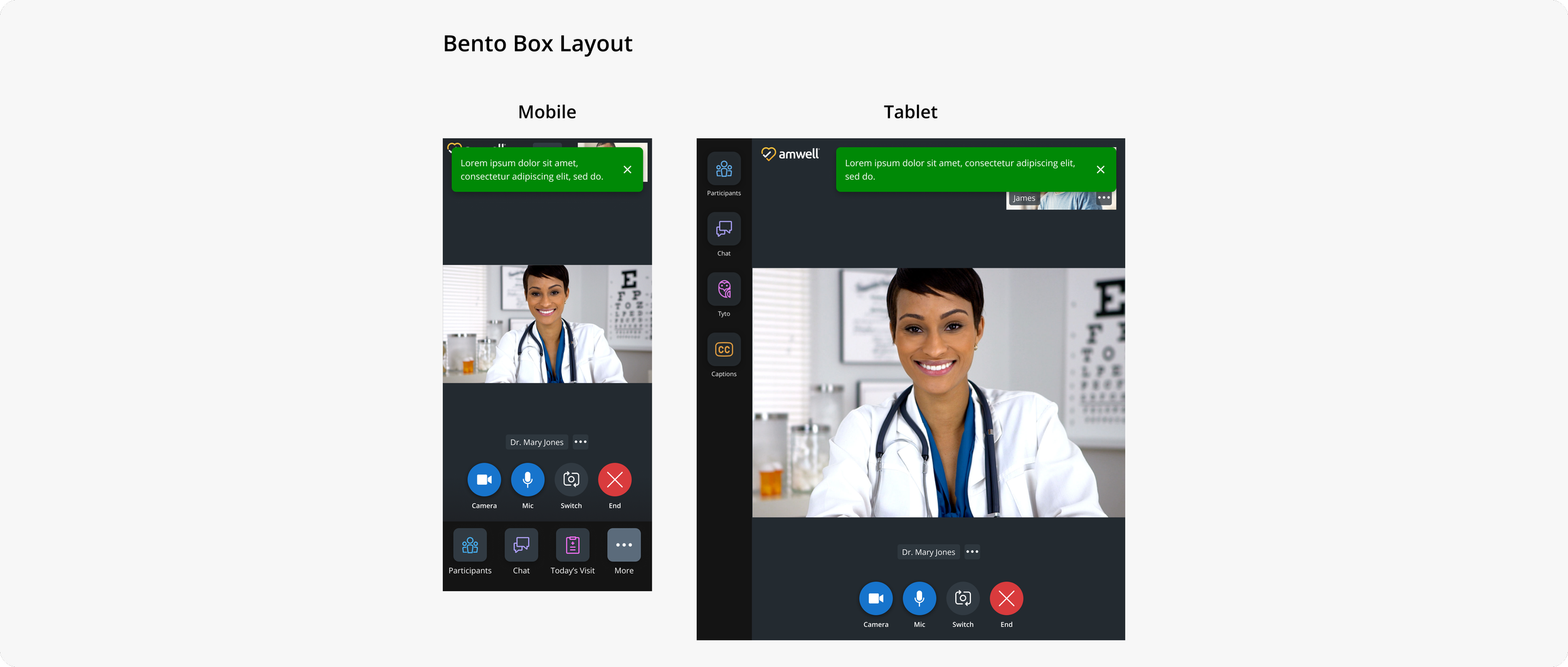
After exploring the different positions in high fidelity mockups, I confirmed the top and top right corner position for mobile and desktop work well across different products. I created the following documentation so that designers could easily visualize references.
In the mockups, I explored the type 3 and bento box layout because these were the only layouts in which we have used notifications so far. In the documentation, I also applied the rule for Type 1 and Type 2 layouts that are used for the patient experience. I didn’t foresee issues because the content is already self-contained and would not be obscured by notifications in the top area and top corner.


Anatomy/styling
During my investigation into snackbars, I observed inconsistent usage of an outlined style and filled style. There wasn’t an intentional pattern of why one was used over the other. On our design system portal, the outlined style was named “Snackbar” and the filled style “Special Notice”, but the function and usage were indistinguishable. The only difference was in styling.
I proposed to use a single style and update our documentation for the “Snackbar” component to reduce inconsistency and confusion. To aid the decision, I explored the outlined and filled style in light and dark themes. It was especially clear in light theme that the outlined style was not visually prominent enough. Additionally, I consulted with our WCAG expert and he supported that it was easier to see the filled style than the outlined style.

On the design system portal, I also saw a lack of documentation about color usage. This contributed to inconsistencies and I created the following guidelines to fill this gap.

Width behavior/max number of lines
I also identified a need to improve the width and text behavior of the snackbar because there was an issue with readability. The snackbar component expanded to an arbitrary max width that was longer than the optimal line length for readability.

According to the Baymard Institute, the optimal line length is 50-60 characters per line, including spaces. Therefore, I created a new rule for a maximum width at 502px and a general guideline to keep copy short for improved readability.

Results
The updates for the snackbar component improved usability and reduced inconsistency across our consumer, provider, and admin products. The enrichment of component documentation also unified our team of designers and developers.
Future efforts
In the next phase, I plan to further explore a pattern for viewing multiple notifications.

Additionally, I saw an opportunity to create documentation for the larger collection of notification components. There were no guidelines established on the different uses and hierarchy of notifications. I designed a visual for some documentation that will be further fleshed out in the future.
